How to Use Plants in Modern Interior Design
Use plants in modern interior design, they make us happier, help us recharge and even be more productive.
Plants tend to be an afterthought in interior design. And the more bad experiences you have with plants (in other words, how many of them die at your hand), the more likely you are to push them to the back burner or forget about them altogether. However, we know that plants make us happier, helps us recharge and even be more productive.
Using plants in modern design is even more of a challenge because modern design seems to demand clean lines and simplicity. Nature, on the other hand, tends to be wild and chaotic. However, that doesn’t mean modern interiors need to forego greenery. There are ways to make it work and bring plants into the design as a creative layer that is equally as important as the other accessories in the room.
E-design firm Decorilla’s goal has always been to flip the interior design business on its head by making outstanding design services available to everyone, no matter the budget. They’ve just made a game-changing partnership with Brooklyn Plantology to add a botanical catalog and green design as a part of their services.
The two companies recently collaborated on designing Benchmark Real Estate Group’s new Eleventh and Third apartment building using sculptural botanicals to soften the edges of this modern space, transforming it into a home.
The Power of Plant Design
Plants can be as expressive as a work of art, so the designers integrated potential plants and vessels into their plans based on suggestions from Mary Ann Rounseville of Brooklyn Plantology. Her expert advice considered what resonated in the designers’ concepts and centered on the plant lighting, design purpose and maintenance. Apart from the obvious design aspect of the process, it’s important to know what is going to live in a space and what is manageable around the lifestyle of the homeowner. No one likes to kill plants!

Proposed Green Design
To start this process, the Decorilla designers created niches and special areas that could serve more than one purpose and artfully display well-chosen plant and pots on the floor plan.
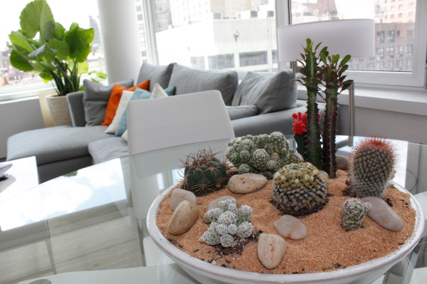
The long linear windows come to life, bridging the outdoor and indoor world with a tall textured planter and gorgeous Alocasia. Cacti fit into a modern environment naturally given their geometric forms. A world within a world, the cacti were used here to create a mini-landscape and condense a whole plant story into one ceramic base, which is unique and useful for apartment living. The sand and stone bring in some earthy elements and serve as a canvas for the variety of cacti shapes. The almost-invisible glass dining table from certain angles reflects the sky and clouds, making for further connection with the outdoors and nature.
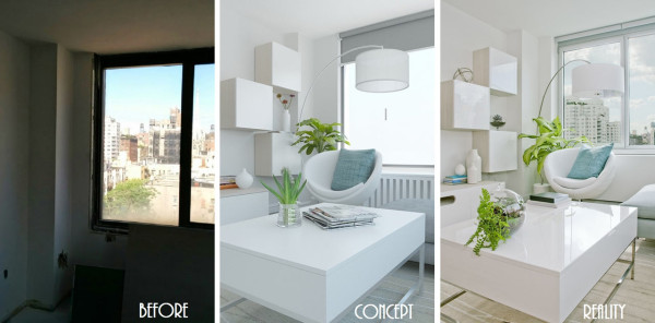
Modern white box cabinets, a round swivel chair, and an overhanging lamp were incorporated to transform the empty space, allowing for extra seating when entertaining and creating a serene reading nook when home alone. With clean lines and neutral palette, accents like throw pillows, vases and botanicals are highlighted. Mary Ann worked with Decorilla Designer Quyne Nguyen to create a concept that used the vivid green of the Dieffenbachia plant to bring this white corner to life.
The Diffenbachia plant is a special variety with light limey green leaves that look like they’ve been splattered with darker green paint. They add a gorgeous modern art-like texture to the white furniture while gracefully exploding in the background.
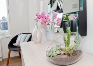
Some of the plant elements called for simplicity so as to not overwhelm – a grey blue and rose-colored succulent in an open glass bowl on the slick white cabinets, for example.
The glass terrarium on the coffee table is portable and an easy element to move around in certain times of the year. It can even be hung. The plants in the terrarium are kept out of direct light. Glass is a great design element for plants, they allow for light and don’t feel as heavy as some planters can feel, which is very important in small apartment living.
Complementing Plants with Decor
Using the valuable indirect light in the bedroom, a small leafed Fiddle Leaf Fig in a square white pot was placed in an empty corner, which helps to round out the room. Larger versions of the Fiddle Leaf Fig are often featured, but we preferred this compact braided vine version, which doesn’t disturb the window view nor block light and provides the perfect scale for a New York apartment bedroom. The layered dinner plate-shaped leaves contrast the linear pillows and artwork, all connected with a welcoming organic color palette of blue, green and grey.
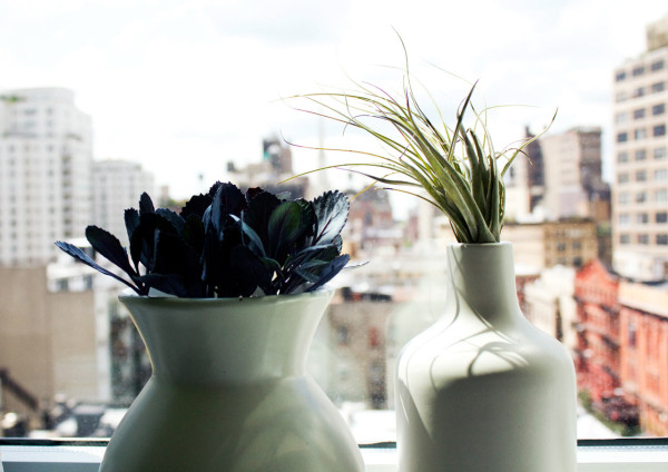
Small details make for a warmer home, like these two naturally-shaped vases placed on the bedroom windowsill. Black cabbage and an Air Plant were used here. Not a typical combination, the greyish black purple leaves and grass like shapes add plant life to the diorama of the city landscape.

Another small ecosystem of succulents and cacti was created to add a point of interest for the multi-faceted mirror, which beautifully reflected all of the green elements. The mirror gave the illusion of having more beautiful accents without taking any room space! This long white oak dresser appears less blocky by adding rounded elements such as a glass bowl and vase to soften the corners and add dimension to its surface.
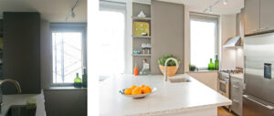
The final challenge (and one of the most important tasks) was to create a kitchen environment that was functional, beautiful and ties in with the entire space. There’s nothing more pleasing and convenient for a home chef than picking herbs right from their own garden. It’s even more rewarding when you live in a city, so a small herb container was installed in the kitchen window to make the most of the light and to bring some edible plants into the mix like Lavender, Basil, Thyme and Oregano. The container is also small enough to bring right to the counter during cooking and also, allows for window opening.
The kitchen feels less modular by adding this organic shaped pot with Jade on the counter. It also enhances the subtle richness found on the accent wall and kitchen cabinets.
Making Use of Textured Plants
The Alocasia, also known as Elephant’s ear, in the large natural white ribbed pot serves as a relaxing contrast to the industrial skyline all while working within the design palette. The orientation of the apartment has gorgeous indirect sunlight most of the day, which is a dream for plants. The indirect light shows off the fan-like corrugated leaves of the Alocasia beautifully.
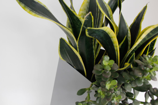
This geometric Planterworx planter was placed on a small entryway table to act as a welcoming element into the open living space. With its linear lines and cascading plants, the planter is the prefect home for this Snake Plant and Jade, which are two of the easiest houseplants to maintain. The lines of the Snake Plant draw the eye up and out of the geometric planter and the grey backdrop shows off the heavily variegated leaves. The Jade softens the whole look and add another textured element.
Website: design-milk.com